 Posted on 26th Oct, 2021
 Last updated 2 years ago
Modular-scale typography looks harmonic to the eyes, whereas Fluid typography is more responsive, but may require some guessing and tweaking to find out what looks good. However, in this post, I am going to discuss a design method I recently created that takes the best of both worlds, and gives that to you.
The generator
If you have already read this post, and came here again only for the generator, here you go.
Fluid-Modular Type-scale Boilerplate Generator
However, if you haven't read about my method, I would suggest you to read this first, to get my idea.
What is the Modular-scale?
If you don't know already, the Modular type-scale is where all progressive font-sizes (that show hierarchies) are in geometric progression to one another. In other words, each subsequent font-size is the product of the preceding font-size and a Modular factor (which is a decimal).
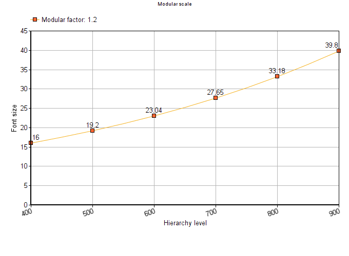
For example, taking the base font size of 16px and a modular factor of 1.2, this is what you should use as font-sizes in your design: 16px > 19.2px > 23.04px > 27.65px > 33.18px > 39.8px ...
Choosing font-sizes in this manner creates a harmonic hierarchy that looks good. However, you see that the font-sizes remain constant for a constant base font size and modular factor.
Fluid-typography
In the fluid-scale typography, there is no maths behind the relationship between each subsequent font-size, unlike the Modular-scale. Instead, you pick an arbitrary font-size, and add some viewport units to it (like vw).
Since the resulting font-sizes are a direct function of the viewport dimension, you get a fluid resizing of the fonts as the viewport shrinks/expands. The lack of a proper pattern between each subsequent font-size, however, means that you have to manually play around the values to know what looks the best.
The problems
The Modular-scale offers a good hierarchy, but making it responsive would require multiple media queries.
The Fluid-scale offers good responsiveness (sometimes, even without media queries), but the requires manual tweaking and guessing to figure out what sizes look good.
The aim
While working on a recent project, I wanted to implement a good font-size hierarchy without writing complicated media queries. That's when I began thinking of a new approach.
The new approach must:
Require no media queries.
Be fully fluid.
Adapt to all viewport dimensions on its own.
Look good.
Fluid-Modular Typography
So, I developed what I call 'Fluid-Modular Typography', that fulfils all the above aims.
Guidelines
These are the guidelines I formed. The whole Fluid-Modular design system is based on these:
A base font-size is chosen for the base hierarchy (used in body), and remains constant regardless of the viewport width.
Base font-size is clamped between some values to get other font-sizes for other hierarchies (explained in the next section).
All spacings (margins, paddings, etc) are derived from the base font-size, to implement vertical rhythm.
How it works
Let's first visualise the Modular-scale, with a base font-size of 16px and modular factor of 1.2.
And here's my idea: Instead of using one modular factor, let's use two. That way, we get two hierarchies. We then will 'sandwich' the actual font-size (that will be visible) between these two ranges, adding some viewport units, to make it fluid while still keeping it almost modular.
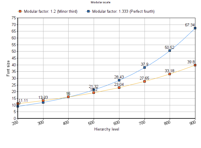
Let's visualise this with an example. Let's extend the above graph by adding one more modular factor (1.333 this time), and adding some more hierarchy levels (preceding the ones that you saw above).
Now that we have an upper limit and lower limit, all that remains is to clamp our ideal (fluid) font-sizes between this limit.
Here is an example:
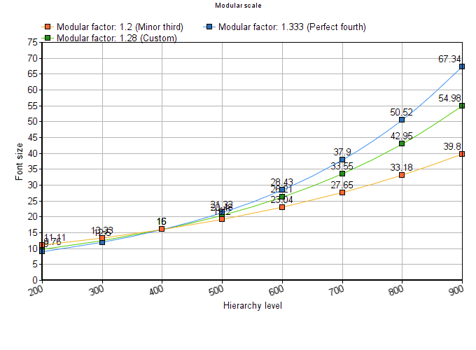
Notice how the green line (our ideal font-size) is modular.
Now, for the final part. How do we implement this?
How to implement this?
Decide on a single base font size, minimum modular factor and maximum modular factor.
Perform calculations to get modular font-sizes for both these factors.
Clamp each pair of min/max font-sizes to get the fluid font-size, i.e,
fluid font-size = clamp(min font-size, min font-size + Xvw, max font-size).
In the above steps, notice that the ideal font-size is augmented with Xvw (that is what makes this fluid). The value of X has to be chosen incrementally to compensate the rate of decrease/increase of fluid sizes, with higher X values for extreme hierarchies and lower X values for the ones in the middle, taken in an arithmetic progressions (almost).
These are the X values that I found that works good, arranged in increasing order of hierarchy:
(lowest hierarchy) 4 > 2 > 0 (for base font-size) > 1 > 1.5 > 2 > 3 > 4 (highest hierarchy)
Generating the boilerplate CSS
All these calculations might be too complicated to manually implement in every project. So I developed a Fluid-modular Type-scale Generator.
Feel free to use that, both for generating the boilerplate CSS, or to see the Fluid-modular type-scale system in action.
Ending note
I am really looking forward to hearing from you on how you found this approach, and if you found better vw offsets.
Also, if you use it in your projects, don't forget to tell me about it.

